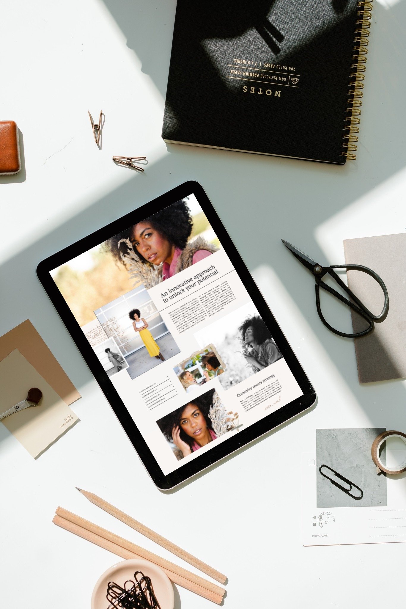
10 Brand Photos Your New Website Needs
Design. Copy. Imagery.
Like a three-legged stool, they each play a vital role in support of your website goals: clicks and conversions. But sometimes that stool gets off-balanced.
I’ve watched many business owners enter the process of creating a website for their business or personal brand and end up so overly focused on the design and the copy that their pictures became an afterthought.
While your visuals do help to communicate your brand's personality, message, and values when people aren’t reading – they’re also so much more than that.
Your brand images are tools in the hand of your web designer, and if you can get just the right ones, the three-legged stool balances, and your brand naturally elevates.
I’m an Austin branding photographer, so for this post, I reached out to a web designer I trust and work with. She gave me 10 images that every website needs. Here’s what you need to get…
1. Image With 2/3 White Space – Where You Look Into The White Space
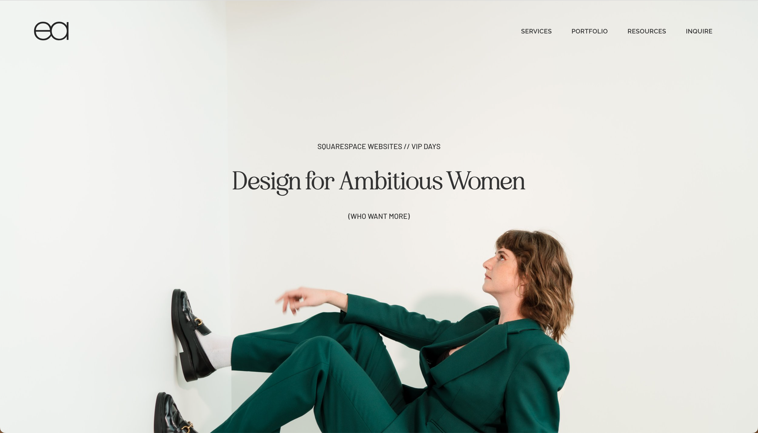
In a 2/3 white space image, your photographer captures you looking into the white space, so that you can later draw attention to any text you overlay on the white space. This is perfect for highlighting important information about your products or services
2. Image With 1/3 White Space – Without You Looking Into The White Space
With 1/3 white space images, you create space for overlaid text without it blocking the image of you. Because the sole purpose isn’t “to draw attention to the text”, there’s no need for you to look into the white space. Instead, you’ll use your body language and facial expressions to match your brand message.
3. Image That is a Literal Representation of Text
Sometimes a literal, visual representation of your website copy is the best way to reinforce your message and make it more memorable.
For example, Emily Agan’s website says, "Kick it into high gear," so our photo of her glorious high kick perfectly aligns with those words.
For these types of images, we have to think creatively. Look for words and phrases in your copy that could be visually interesting and help tell your story.
4. Images Of You Taken From a Variety of Angles
You know, as a business owner, that it's essential to include images of yourself on your website. But you don't want to include a bunch of images of yourself doing the same thing. *cough* Looking directly at the camera and smiling. *cough*
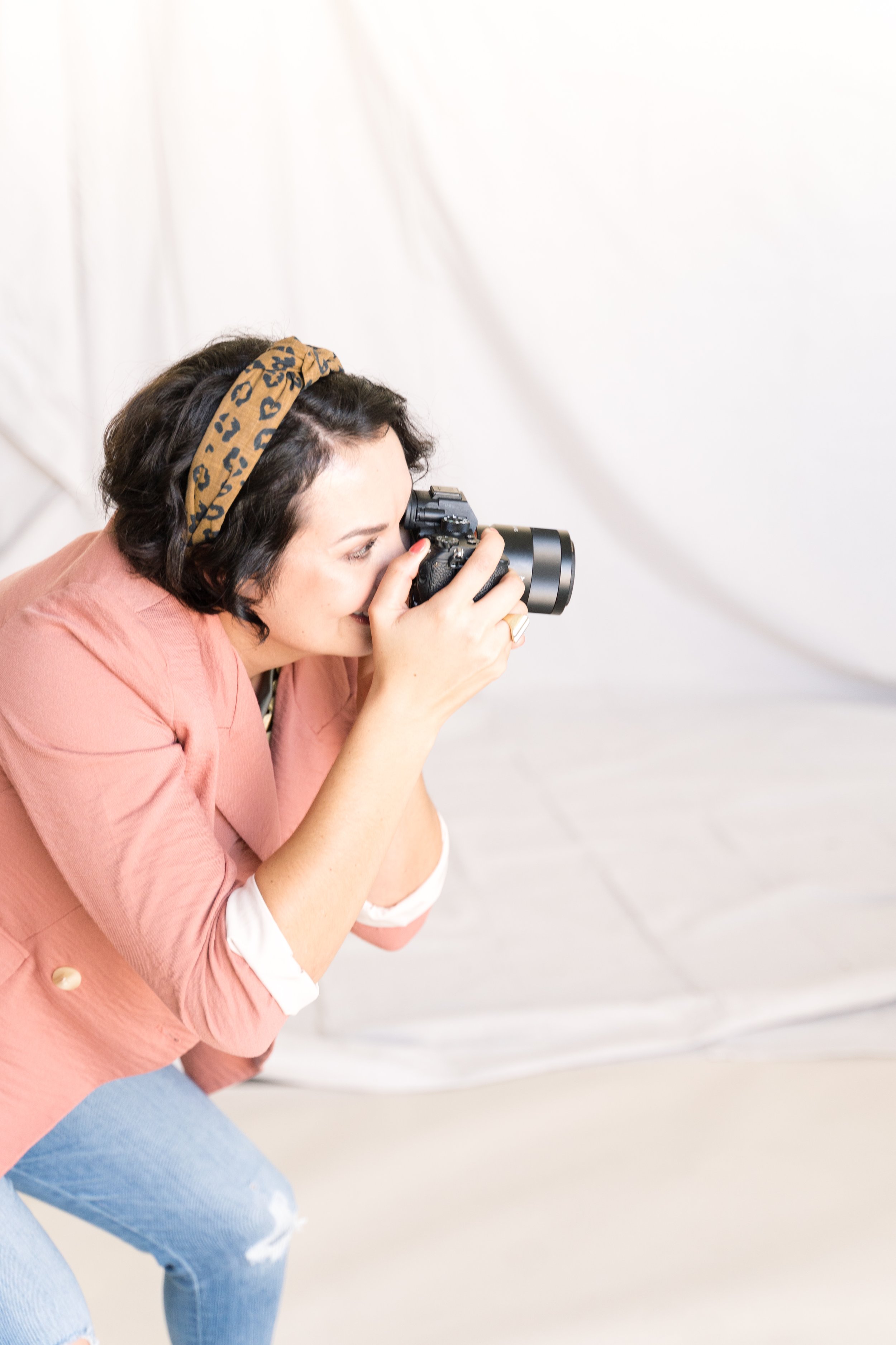
Instead, find a photographer who will take multiple images of you from different angles and in different settings. These will help create a sense of movement as visitors scroll through the page.
5. Image with an Easily Removable Background
Web designers love being able to work with images that have an easily removable background. This allows them to overlay the image on top of a background color or another image in a cohesive manner. Ask your photographer about including images with an easily removable background.
6. Image of Desk/Stuff/Things
Images of your workspace are low-key great for showcasing your personality. They also give your audience a curated and brief behind-the-scenes look at your business or brand.
Include some personal touches, like a plant or a family photo, to make the image more relatable, but try to keep it uncluttered and the background free of distractions.
7. Image of Your Portfolio Work Mocked Up in a Real-Life Scenario
If you're a creative professional, such as a graphic designer or photographer, you'll want to include portfolio images on your website. However, instead of simply having a gallery of your work, try putting your portfolio pieces into real-life scenarios.
Examples:
If you're a graphic designer, you might mock up your work on a laptop or a phone.
If you’re a photographer, get a picture of a magazine in which your work has appeared.
Any real-life scenarios you use should accurately represent your work and help your audience see your work in action.
8. Image of a Single, Solitary Object
Sometimes the most effective images are the simplest ones. An image of a single, solitary object can be incredibly powerful, especially if it's relevant to your brand or message.
Depending on your brand, you could include a guitar, a typewriter, a tennis racket, a floral arrangement, or a camera – as long as it supports your brand, the sky's the limit.
Infusing solitary objects like these in your brand visuals breaks up the heaviness of other photos on your website. It feels strange to have 3 images back-to-back of a person’s face for a service offerings page — but these will break that up and can beautifully feature “packages”.
These simple brand photos can add to the overall visual story, break up your other content, fill in visible gaps, and be beautifully layered.
9. Image of You Talking to a Laptop or Phone
If you offer a service that requires a phone or video call for consultations, the “Book A Call” section of your website is an excellent place to include an image of you talking via a laptop or phone. (Or include one on your services or sales page, like our client Kaely Rd.
This helps to reinforce the idea that you're an accessible, friendly person waiting on the other end of the line so they feel compelled to act on that particular call-to-action.
10. Image of Celebration
Celebration images, such as popping confetti or jumping up and down, can add a fun and lively touch to your website that your website visitors will appreciate. They serve to break up the monotony and add excitement to the experience they’ll have with you.
Also – by showcasing happy and satisfied customers celebrating your brand – you further build trust with the ones who have yet to book with you.
By showcasing happy and satisfied customers celebrating your brand, like this group image on Maureen’s website, you further build trust with the ones who have yet to book with you. In our Signature Austin Brand Photography Experience, we take this even further and create you a celebratory GIF that you can feature on your website instead! That really helps break things up!
Important Note for You, Your Brand Photographer, and Your Web Designer:
I always say that the best possible final web design for your business is created when the web designer works in tandem with your brand photography. Meaning, that you’re not trying to slap a bunch of brand images into an already-made template with a few circles or squares where an image will go. It works and people do it, but it truly stifles the possibilities and the unique-factor.
The best way to go: Create killer brand photography (and copy) for your business that a talented web designer will tactfully and artfully factor into the overall design, direction, and theme of your website — so that these different components of your website complement each other and are working together to pack the most dynamic punch for you!
But first, you need to know what style and layouts of photography & website design you are drawn to and pulling inspiration from. Think about the style of design you like and communicate that to the photographer and designer.
A good way to do this is to pin a bunch of web and brand images and then take a look at what you’ve pinned. Are they mostly vertical? Mostly horizontal? What is the mood and impact?
Knowing if you want more sweeping, banner-style images or smaller vertical images will influence the creative choices for everyone and will help your whole team align to create the website of your dreams.
Bonus Tip: If you bring your web designer an image that’s not cropped for immediate framing…they will thank you!
Professional website designers carefully select and edit every image used on a website so that it fits the overall layout of the page. Unfortunately, most of the time, the images their clients provide are images that have been cropped for immediate framing. That means all excess border has been eliminated, and that can be super frustrating for them.
It’s the raw, uncropped edges of high-quality photographs that allow web designers to zoom in and zoom out with ease. These images give your web designer more space to play with so that they can find the best fit for the page.
It’s a gift that many people wouldn’t even think to give, so your web designer WILL thank you!
Now what?
So there you have it. Images can make or break the quality of a website, but with the right images, you can create a website that becomes an engaging experience for all who visit.
If you live in the Austin area, and you’d like further help capturing these types of images for your brand, I’m here to help.
Check out my story-driven, results-getting experience, and let’s chat. All of these images — and more — are already included in my one-of-a-kind Signature Brand Photo Experience, which will provide you with a complete photo bank to launch your new website with ease and confidence!
I’ll take all the guesswork out of the process for you and work alongside you to craft visuals that convert. You’re gonna love it!
